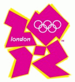
London Olympic 2012 Logo Video Causes Epileptic Fits

As if the crap the London 2012 Olympic Organizing Committee received over this week's release of its much-maligned logo weren't enough, now eight reported cases of epileptic seizures caused by the logo's supporting video have caused the organization to pull the video. Epilepsy photo sensitivity expert Graham Harding explained, "What it appears has happened is that the flash rate of the diving sequence contravenes the Ofcom guidelines." Odds makers have given the logo 10-1 odds it will be replaced by year's end.


Comments
The unartistic shapes, the ugly proportions, the bad colours, the corny concept....It is not a logo, it's a burlesque.
Alan
Alan GS Yates
Schutzenhofgasse 29
A-8010 Graz
Austria
Tel: +43 316 42 37 04
Fax: +43 316 42 91 04
Cell: +43 676 9436143
Email: agsyates@mweb.co.za
Someone told me the new Olympics logo looks like Lisa Simpson giving head...now I can't see anything but that when I look at it...
Here's an appropriate alteration.
http://www.shakewellbeforeuse.com/2007/06/olympic_logo_creates_race_to_r.php
Let's not forget Atlanta changed its Olympic logo shortly after introduction. Good thing - it was bad!
Michael Wolff (of Wolff Olins) blames the response to this masterpiece upon negative publicity.
Erm... no, Michael, it's because nobody likes this crock of shite. And we're even less impressed that it cost us taxpayers �400,000.
I think there is a tie in with the paralympics folks.
Anytime a client wants to play the design-by-committee card, this logo should be shoved back in their face.
"Let's incorporate the numbers 2012"
"Oh, I want it to be jaggy"
"I hear hot pink is making a comeback, let's make sure that's in there somehow"
Guess it doesn't matter anyway considering the world is going to be blown up in 2012 before we get to this Olympic debacle.