London Olympic 2012 Logo Causes Trauma At Wolff-Olins
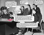
In a desperate attempt to re-spin the London Olympic 2012 logo fiasco into something more positive, the agency behind the log has huddled around the office to see how they can turn the ship around. This captioned photo tells the true inside story of an agency under fire.


Comments
I want a consulting fee for tying in the paralympics. I know Edelman the pr geniuses of the world can fork over at least 100K to me, can't they? They are handling that PR, aren't they. Pro Bono, but it's kinda like the grocery story buy two get one free--cause you been overcharging us for ever now.
I mean c'mon that guy looks like Mr Rogers. It's a beautiful day in my neighborhood. No it's not. Besides where I am living i don't even think it's as big as Edelman's garage.
When something is o abstract you can see the world in it. And that's the olympics.
Disclaimer: I know i will lose my amatuer standing if i take money for this gig.
Not even halfway funny. No wonder most ads suck if this is what the industry thinks is funny.
Scott,
As the creator of this one-off not even halfway funny commentary on what could be going on inside Wolff-Olins, I now feel like the creator of the London 2012 logo must be feeling as everyone rips the design.
But I made this in 10 minutes, not a year.
Yeah, well I still like it.
It is hysterically funny!
The unartistic shapes, the ugly proportions, the bad colours, the corny concept....It is not a logo, it's a burlesque.
Michael Wolff - "What's that sound?"
Londoner - "That sound? Oh that's just the sound of the whole world laughing at you. Ha ha ha. Now give us back our �400,000."