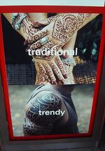
HSBC Makes Good with Ambiguous Tat Ad
This HSBC ad out of Singapore demonstrates what may be a successful attempt to re-brand a stodgy, almost rotary old player into something more contemporary. An interesting choice, though it begs the question which, between "traditional" and "trendy," is actually the positive and the negative. Smart not to paint either option in a bad light. A hat tip to the old boys - at least they know a message is only as good as its interpretation.


Comments
I don't think either is supposed to be looked at as purely positive or negative. This ad needs to be viewed along side it's counterpart: a visually identical ad in which the words 'trendy' and 'traditional' are flip-flopped. The idea being that everything can be viewed differently, including what a bank can do for you.
I don't think either is supposed to be looked at as purely positive or negative. This ad needs to be viewed along side it's counterpart: a visually identical ad in which the words 'trendy' and 'traditional' are flip-flopped. The idea being that everything can be viewed differently, including what a bank can do for you.
Nice clarification.
HSBC ran a whole campaign of similar ads in the NYC subway system in the past year... besides the tattoo version, there were a number of others featuring food choices, music, etc.
Jennifer is right - it's not a Singapore or NYC subway only campaign. And the campaign is very cool.
In the full HSBC global style, the campaign is global indeed - I have seen it everywhere in airports across the United States, and also at the Heathrow Airport in London, too...
Have a look at other creative from the campaign straight from the website HSBC set up to support it worldwide, www.yourpointofview.com.
This is the full series of HSBC print ads http://www.yourpointofview.com/hsbcads_print.aspx, while you can see the selection for the airports here http://www.yourpointofview.com/hsbcads_airport.aspx, and send ecards (after registering to the site) among with are also some of the campaign creative imaginary - ecards here http://www.yourpointofview.com/ecardsend.aspx.
How did I get to yourpointofview.com? Simply because, after being happily bombed by the HSBC images of the campaign (very pervasive across the airport with beautiful images and copy association that makes you think and review your point of view), I get past the boarding gate and just before getting on board I get the reveal - check the pictures I took with my camera http://www.flickr.com/photos/burningmax/sets/72157594428213930/ - sorry the quality of the shots is cheap but I'm always running late at airports and I was about to miss my flight! :(
By the way, see how the word "world" is ALWAYS in the copy of each version of the reveal ads, with the "world's local bank" tagline - the campaign is obviously meant to drive people to abandone prejudices, look behind their beliefs and don't be afraid of differences - the best way to approach global business... and life in general, I guess...
Happy Holidays everybody to everybody at AdRants,
Massimo aka burningmax
Nice that this campaign has been seen "globally" across the US - oh and London.
I believe this campaign has been in every market that HSBC operates in across the global - that is including the globe outside the US. It has been running for over a year now.