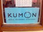
Brand Identities Filled With Pedophilia, Faggots, Bodily Fluid
It seems a lot of businesses in this world need a slap in the face when it comes to the double meanings their company names and logos connote. First, we have pediatric doctor's office signage that alludes to pedophilia. Next, we have get rich quick wackos who like to embed their sexual preference in their logos. Now, we have a store in Brookline Massachusetts that likes to create visions of a certain bodily fluid with its unfortunate name KumOn. Perhaps everyone really is as bad at proofreading as we are.


Comments
If it's any better, it's pronounced Coo-mon and it's Japanese... http://www.kumon.com/
There's a whole town in British Columbia called Kumsheen. That's a strange civic pride.
*high-fives Steve*
Aw shit, I misspelled my own name
Okay, I see how the KUMON and F.A.G. logos are funny, but I don't get the "Pedophile" joke for the Arlington Pediatric Center.
I see an adult comforting a child.
Personally I think the Pedophile instead of Pediatrics is a stretch.
im no pedo, but i think its pretty clear - comforting is apparently a fine line.
There's a whole town in British Columbia called Kumsheen. That's a strange civic pride.
I used to live in Iowa. They have the best named gas station chain. Kum & Go. Perfect for those late night... oh you get the idea.
www.kumandgo.com
I used to live in Iowa. They have the best named gas station chain. Kum & Go. Perfect for those late night... oh you get the idea.
www.kumandgo.com
I used to live in Iowa. They have the best named gas station chain. Kum & Go. Perfect for those late night... oh you get the idea.
www.kumandgo.com
I used to live in Iowa. They have the best named gas station chain. Kum & Go. Perfect for those late night... oh you get the idea.
www.kumandgo.com
I used to live in Iowa. They have the best named gas station chain. Kum & Go. Perfect for those late night... oh you get the idea.
www.kumandgo.com
Whoa, easy on the post button there, Derek.
Derek, did you used to live in Iowa?
I digress... often if you mention that you think a word or logo is off-color, the rest of the room will look at you like you're a perv.
A company I once worked for abbreviated the word count on a report as "cnt" It was set in 6 point type. When I mentioned it might be innappropriate and suggested using the symbol #, I got some looks.
Not only that, when the final report was distributed, it was mentioned that is was changed because "someone" thought it looked dirty.
Dumb cunt.
This is totally unfair. Kumon is a company from Japan that offers tutoring for children. Started 50 years ago by Toru Kumon. Shame on you for not doing ANY research before posting this logo.
OK, OK, so I often check out your site and I am titillated by your obsession with tits and ass in advertising, but hold on there a moment. I have been associated with Kumon for over 5 years and I can tell you that this is an organisation that holds a childs welfare as its highest priority. Noone has ever, ever, EVER made the jump that you made, and that says more to me about were your mind is than any subverted subliminal message in the logo. You sir, are an asshole. Get your mind out of the gutter and do something worthwhile with your abundant spare time.
let's clear this up. Aside form that fact I just may be an asshole which, by the way, is fine with me, just because a company has been around forever and does wonderful things for children, which Kumon does, does not mean they are expect from comments on the cultural and societal implications of what their logo may or may no represent. That's all we're talking about here. The logo. Not the company and all the good things it may or may not do.
Also, the logo was sent to me by a reader who, prior to my apparently guttural mind making any sort of leap to bodily fluids, planted that seed in my head.
You also outta know if you've been reading us for any length of time that we're not Ad Age and our stories will never be presented all tied up pretty with an editor's bow on top. Why would we want to duplicate that fine editorial establishment when we can have way more fun doing things our way?
I've been going through the kumon.com site and laughing my ass off thanks to this topic. I make no apologies for my "gutter mind". Thanks, Steve. Have a great weekend.
Here's another thought: not to disparage the work this group does or anything, why does the character in the logo look so forlorn and/or dumb?
Funny, I guess word got out about the Arlington logo and it's different on their site now.