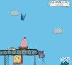
Beyond Weird Winterfresh Promotion Good

This is beyond weird. Beyond different. Beyond odd. In fact, it's so beyond weird, different and odd that it's actually great. It's a mini campaign for Winterfresh gum.

|
|||
| About | Contact | Media Kit | Twitter | |||
Comments
More like beyond irritating. So beyond irritating that it's irrelevant.
I totally disagree that it's irritating. The TV spots stand out like nothing else on the air...a breath of fresh air, no pun intended. And the Web site is just good old goofy fun. I love this campaign. Kudos to the agency and the client for doing such irreverent work.
Eh. Better than the old Winterfresh stuff that tried to be black.
The Timberland/Hilfiger case studies have fucked up more MBA brains than anything else in 10 years.
Although, this feels like it's just copying the stuff that's online--specifically the "end of the world" flash movie--it doesn't just co-opt it like WK did for Nike's online campaign.
BTW-WK also ripped off Mother's "wake up call" campaign for Target for their own "wake up call" campaign they ran with the RockNRoll Ain't noise pollution TV spot.
I wouldn't work for Wk for an anything...
should have read the above posts before digging for this URL.
http://www.ebaumsworld.com/fhlash/endofworld.html
But I dig the campaign. I'd forward it.
I love these ads. Gum should be fun, and I think these ads are fun.
Right up there with the new Element car ads: "I pinch."
The ads are fresh. There are a lot of jokes in them I didn't catch first time around.
saw the spots on TV, very different from the nicely produced stuff out there. it raw, funny and there's a lot going on that you see the on the second or third viewing. it is stoooopid humor at its best. the website is freaky cool, love the lil guys that says 'Booyah' when you click on them.
saw the spots on TV, very different from the nicely produced stuff out there. it's kinda like the some of the flash films you see on the web - raw, weird, funny. the website is whacked out, love the lil guys that say 'Booyah' when you click on them and that stupid song. got me hooked.
It's the most fun I've had on the web with an ad in a long time. It's totally fresh and I can't believe that it actually made it through the pitch process. Very indie rock too. A+, I'll forward it and my friends will laugh.
I think the http://SnickersSatisfies.com site is much weirder. It's different every day and every one is weird.
brian
http://candyaddict.com
Who did the work ?
Energy BBDO.
And I totally agree, Dean, what a bunch of hacks. Web sites have been around for years. Ads, too, for that matter. Let's see some original ideas, eh?
I did a search on google and found a funny page on Myspace. It might be by the creator. I think it;s totally clever. Really funny and more interesting that most of the crap ad agencies put out there.
http://www.myspace.com/lovemaestro21
This site is out there. It's wierd, but I got sucked in and played with it for about 20 minutes. It's not like any other brand site. Very cool.
Energy BBDO did the TV. EVB did the website.
I HATE these commercials! They are a flat-out ripoff of cartoons made by Group X, like 'The End of the World' one posted above. I've been raving about this to people since I saw the commercials. It's outright theivery and I sure hope there's enough for Group X to sue.