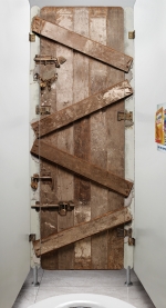
Bathroom Stall Ad Achieves Perfect Contextual Relevance

Leo Burnett Lisbon has done a very cool campaign for Kellogg's All-Bran Plus cereal which found the perfect contextual location for its message: the bathroom stall. The promotion placed large stickers that looked like a locked door or a brick wall on the backside of bathroom stall doors along with another poster on the side wall explaining the cereals benefits.
This is perfect on so many levels. First, it's unexpected and catches attention. Second, the locked door makes the subliminal connection to, well, being blocked up if you don't eat enough fiber - something All-Bran Plus provides. And third, what else is there to do while in the toilet than read an ad. Brilliant work. See the creative in its full glory here.


Comments
Great Job! the guys of Leo Lisbon allways make fresh things. I want to work there!!!
Nice job. Simple. Great. Smell like some awards are coming.
rrrrrrrr....rhrhrhrhrhrh...aaaaaaaaaaahhhhhhhh!
I feel better already.
Goes to show creativity still can be the star! NICE JOB!
CAnnes Lions!!!!
Is it Gold, silver or Bronze?
Well, they might be the first client ever who agreed to present a product you eat in an environment where you - um - do the opposite of eat. I don't feel it's particularly creative, but someone did a great job of talking the client into it.
If it doesn't sell it's just a strange picture.