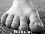
Agency Uses Foot to Promote Branding Service

Here's something you don't see all the time. To promote its branding service Gulp & Go, PR agency Antonia created a video that likens its approach to branding to, well, a foot. Oddly, it all makes a convincing argument.


Comments
That idea is to branding as Pat Robertston is to the Russian Mafia. Not so much. :)
"it all makes a convincing argument"? Hardly. Interesting concept, I'll give you that. But the execution is off-track, way too confused, convoluted and intangible. Perhaps it's the result of an identity crisis among Antonia itself. A word of warning, Antonia: spare us the artsy speak. If you can't communicate who you are and what your brand truly stands for -- in simple, comprehensible, believable terms -- how will your clients feel like their brands will be justly dealt with?
Hi all!
Thanks for taking the time to post your comments!
RLR, we've noted your points! This being said, that movie is meant as a tongue in cheek feature and we certainly are not releasing it as the cinematographic masterpiece of the XXIst century! As far as identity crisis go, no, we're pretty much at peace with ourselves (well, as much as French people can be anyway ;^) but we believe a day without a laugh is a lost one. This is the spirit in which we are, very humbly, introducing this clip to the community of the Internet.
FJ
FJ was kind enough to write me to ask me what the hell I meant in my post.
Connecting the idea of a foot with your brand is fine as a creative vehicle. The context of the words, however, is unclear. "Foot to Flop"... as in, a "flip-flop"? That's the first thing that would probably come to mind. There's no relation between the two other than the first letter, and that's not very powerful. And the entire moose thing...is...related...how?
I agree with RLR: the message is confused, convoluted, etc. What would be more interesting is to make the foot, i.e., your brand, KICK ASS. Literally. Or trampling the competition. Or smelling like roses. Or toeing the line of creativity, bringing the competition to heel, yadda yadda. If you're going to use a metaphor, use one that leaves a more powerful, memorable message.
In my opinion, nothing should be in the campaign that's not immediately relevant to the desired message, which is, "we are using this cute metaphor to tell you how we can help your brand better than anyone else". The guy whose face keeps popping up...how exactly is he related to all this? Why does he appear multiple times? What's he got to do with anything? The lady in the hairdryer...same thing..."cute" doesn't necessarily mean memorable or relevant.
If branding is about a unique, compelling service that communicates a relationship and its benefits between provider and consumer/client, then your movie better do that for Antonia as well.
C'est simplement l'opinion d'un homme. Comment dites-vous "le prenez-vous avec un grain de sel" en fran�ais ?
Hi again!
Thank you very much for your kind message and detailed explanation.
You do raise very valid points with regards to keeping things to the point and using a powerful metaphor. In fact, the whole "Gulp & Go" brand name revolves around such an idea: keep PR effective, on the move and, above all, deliverable in a bundle, quickly. All the metaphors you bring are indeed very consistent with the foot and we considered following that straight line in our original drafts.
The reason why we went the opposite route with the Moose is to underline the spontaneous part of the package, as a contrast to our written site that, in itself, presents the project in its organized rigor. The idea here was to highlight the light side of things and the "grain of salt", as you say, that can give a potentially serious brand or project a positive kick. All in all, that movie is meant more as a tongue in cheek complement to the site than a standalone introduction to the project, for an outside observer - which I believe also answers RLR's comments about Antonia's identity and how this relates to it.
The lady in the hairdryer will ring a bell for our existing customers as it is a recurrent icon (and a traditional wink) here at Antonia. She makes a cameo appearance as the movie was originally released to our long-time clients and partners, as part of our periodic media update.
Thanks again for taking the time to elaborate on your comment. It seems we agree on the ground principles you outline but the movie was in need of some more introduction. It is indeed l'opinion d'un homme but that homme matters a lot to us and we always welcome input and feedback!
Truly yours,
FJ
Antonia, Founder
I just love the gay shot on your homepage. I wonder who shot their load to capture such a vivid image.
Good Job Boys.
Hmm, we searched a lot to find a model willing to shoot his load live and, after much asking and emailing, settled on a bottle of mineral water, which turned out to be a wise choice as it was most cooperative during all the shoots.
Amazing how a picture of a man drinking can be perceived, uh? ;^)
FJ