Infographic Examines Evolution of Big Brand Logos

Evolution_of_Logos_cropped.jpg

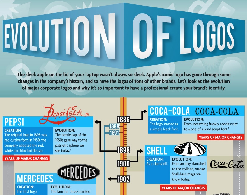
Ah, yes. The logo. That emblem which represents the essence of a brand in a way that communicates its purpose in mere seconds. Or at least that is the hope. Over the years, brands have evolved their logos as both the times and the brand, itself have changed.

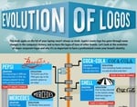
Taking a 100+ year look, this infographic from Graphic Design Degree Hub examines the transformation of logos from Pepsi, Coke, Shell, Mercedes, Kodak, IBM, Chevrolet, BP, UPS, Ford, Xerox, Canon, Walmart, Apple, Microsoft and others.

Some early logos from Kodak, IBM and UPS look nothing like their current iterations.

Also explored are logo screw up like the London 2012 Olympics and the Arlington Pediatric Center, both of which connoted something completely different from their intended goal.

logoevolution.jpg

Picture of Steve Hall

Steve Hall

RECENT ARTICLES

TRENDING AROUND THE WEB

9 simple practices of people who quietly get more done than everyone else

9 simple practices of people who quietly get more done than everyone else

Hack Spirit

People who prefer a quiet night in to a big night out usually share these 8 qualities

People who prefer a quiet night in to a big night out usually share these 8 qualities

Hack Spirit

7 signs you have an old soul that others quietly admire

7 signs you have an old soul that others quietly admire

Hack Spirit

What editing other people’s writing teaches you about your own

What editing other people’s writing teaches you about your own

Global English Editing

9 small habits that quietly push grown children away

9 small habits that quietly push grown children away

Hack Spirit

7 things you stop caring about once you’ve truly settled into who you are

7 things you stop caring about once you’ve truly settled into who you are

Hack Spirit