Hatten’s Ode to 2012 Olympics is Rebranded, Re-Undesigned ‘Unionjack’

new_unionjack.jpg

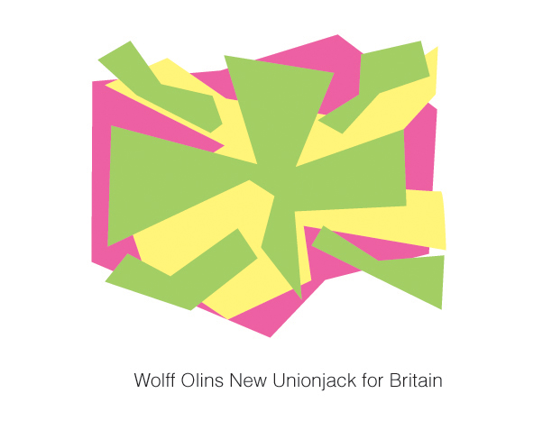
The London 2012 Olympic logo having pulled a Pokemon on us, Phil Hatten Design decided we could all use a little Wolff O’Branding. So they decided to re-brand, re-undesign and re-spell the Union Jack as the Unionjack (at left).

True to Wolff Olins’ branding manifesto of “frenetic, contemporary and stretchy (which they call ‘dynamic, modern and flexible’)” design, Hatten lamented he was only able to work the word “branding” in twice.

In the forward-looking spirit of 2012, the final result looks like some hacked-together early 90s concept logo for a shoe that lights up on impact. The only thing we need is a remixed version of the “Clarissa Explains it All” theme song, and hey, we’ve got a new anthem, too.

What do you say, UK?

Thanks to Scott at Advertising Industry Newswire for the heads-up.

Picture of Steve Hall

Steve Hall

RECENT ARTICLES

TRENDING AROUND THE WEB

Why the best listeners rarely give advice unless asked

Why the best listeners rarely give advice unless asked

Hack Spirit

7 things people with natural confidence never need to announce

7 things people with natural confidence never need to announce

Hack Spirit

10 small signs you’re more respected than you realize

10 small signs you’re more respected than you realize

Hack Spirit

7 small habits of people who never seem rushed, no matter how full their lives are

7 small habits of people who never seem rushed, no matter how full their lives are

Hack Spirit

7 things genuinely classy people do during awkward silences

7 things genuinely classy people do during awkward silences

Hack Spirit

9 phrases classy people use to end a conversation gracefully

9 phrases classy people use to end a conversation gracefully

Hack Spirit