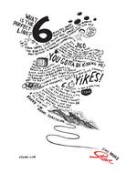
Stowe Gets Artsy with 'Find Your Perfect Line'
Who says ski resort ads should all feature generic slopers in big jackets sliding down a sweeping powdery slope?
Stowe gets a little creative, crafting mountains out of whimsical text that's something between a ski bunny's stream of thought and coutourier philosophy. A single splash of color illustrates the Stowe logo. We like. Yes, even if attempts to read the text hurts our necks. Check out more prints here and here. - Contributed by Angela Natividad


Comments
Anyone know if James Victore did the illustrations? If not, someone's taking some serious crib notes from his style book.
I disagree. This is not good. It is merely some inane ramblings loosely connected with, and therefore way too cool for, an overly simplistic metaphor for a run on a mountain. And i don't understand why the copy is all wavy-loopy-pants.
Hey Stowe: your strategy is showing.