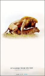
Draft FCB Gives Yet Another Reason Not to Select Them
Adrants reader Dresden directs our attention to the super-classy Draft FCB congrats ad to all the winners from last summer's Cannes ad festival.
Dresden wryly notes, "Perhaps they should be the first to receive the 'Neal French Award' for non-creative, derivative, tacky work trying to pass as advertising..."
Ooh, that burns going down. Bottoms up to Draft. - Contributed by Angela Natividad


Comments
People who don't like Neil French because they think he's sexist and whatever...fine. People who don't like Neil French because they think his work is derivative and non-creative... that's just plain stupid. Sexist or not, he's still probably one of the best writers in the world. Dresden should go look at his website and actually see his work.
Here, here.
Don't try to Fox News the guy into a bad creative because he (supposedly) had some sexist outburst during "A Night With Neil French" in Toronto. The guy's writing has held up for decades.
If you're the lioness, it's good to be on the bottom, too. This ad is either lame or sexist, depending on your point of view.
This has already been hashed and rehashed on adfreak.
gee len, i've never seen something appear on more than one advertising blog before.. thanks for keeping us in check!
i like the spread... there are a million different ways they could have expressed their gratitude... however this one works(in my opinion)
Sex is sex, the lions are amusing, and at least the ad doesn't insult us with throwing out the latest cleavage showing bombshell form Oklahoma named Simpson, or is that Arkansas, or...
DofAM
brent, why do you think that it works? I don't, but I'd be interested in hearing why you like it. Aside from being crass and puerile (though that's never stopped us ad creatives before), IMO it's just not that clever an execution. It doesn't pass what I call the eye roll test, and frankly reflects poorly on the agency that created it. Now, if it was a lion on top of some other animal, then the copy makes more sense. But sill, it would be a terrible ad. Sexist? No. Just bad.
Creative would�ve been working Sam Walton in there someplace.
This is the best blog you have
This is the best blog you have
I learned animals actually procreate. Sex is chiefly for humans.
I remember a fraternity at my alma mater having a rush shirt with the same image and headline. Nice work.
Hopefully this will be followed up with an ad announcing how to stay on top "more to come?"........in a world of pitchers and catchers, it's rarely the pitcher who complains. ROAR!
Hopefully this will be followed up with an ad announcing how to stay on top "more to come?"........in a world of pitchers and catchers, it's rarely the pitcher who complains. ROAR!
Hopefully this will be followed up with an ad announcing how to stay on top "more to come?"........in a world of pitchers and catchers, it's rarely the pitcher who complains. ROAR!