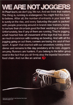
Pearl Izumi Pushes Pretense to Promote Rubber Pumps
We're usually big typography fans, but, as AdCritic so eloquently points out, this Pearl Izumi ad is bordering on Pearl S. Buck territory.
And not all that well, either. The elitist mini-rant against jogging is cumbersome and a pain in the ass to read. Oh yeah, and way to alienate all of Evian-sipping, yoga-posing jogger-kind. Care to turn off the sprinters and trotters next? We're pretty sure they don't need tennis shoes.
For more runner's manifesto (11 pages worth, in fact), hit the We Are Not Joggers website.


Comments
See also: Jeep ad in this week's New Yorker.
Elitist is right. I will smack these people in the head as I ride past on my bike.
You will know me by my lack of fancy bike-riding attire. I'll be in flip-flops and regular old shorts, probably in an untucked, short sleeve button down shirt. (white, to beat the heat) I'll be getting my exercise in a much more fun way than your sorry RUNNING ass, and I can coast when I want to. Oh yeah, I saw the bike clothes at your website. "Pearl Izumi�s proprietary advanced aerodynamic fabric and aero-inspired design come together in this high end short." For $160, those shorts had better blow me too.
Not all of us are hardcore competitive athletes, Pearl - and most of us don't even wish to pretend we are.
Bill: linky linky =)
It's not about whether you agree with it. It's well-written--a great voice. It's a position. And it's getting us, at least, to talk about the brand. Gotta take a stand to stand out.
I think the copy and art direction is clever.
I think the copy and art direction is clever.
Art direction of the print ad above looks like it was done in the 80s.
F-ing obnoxious drivel. I'm going home to burn my Pearl Izumi shorts. AFTER I jog in them (evil laughter here).
um, call me literacy challenged or literature-culturally retarded but can someone please explain the Pearl Buck reference, for the Good Earth's sake? Thanks!
Post a comment