We should start by saying that by the time we got to watching this ad for Wendy's by Saatchi & Saatchi, we were already a bit out-of-sorts because the eagle in this Unicast ad kept squawking. Eagles are just generally really distracting. They are exactly the opposite of ninjas.
Anyway, this Wendy's piece involves communal tree-kicking and a burger-inspired epiphany by a guy wearing the Wendy's girl wig. We're not really sure why. And if it does nothing else, the spot decently demonstrates that people who do stupid crap as a team will probably band together behind something equally inane.
To be fair, though, we'd rather watch this ad than another I'm-Lovin'-It rehash.
Hillary, who for the 2008 presidential campaign is pushing viral in a big way, recently invited would-be voters to help her pick a campaign song.
Here she discusses the results and even sort of invites people to laugh at her, except with Hillary one never feels comfortable laughing about anything.
If we were Hillary we'd play the Darth Vader theme everywhere we went and act really pompous (think Xerxes, 300).
Hit the Hillary Clinton website to find out which song won. It probably wasn't the Darth Vader theme, but that would have cost way too much anyway. Sanjaya's looking for a gig, though.
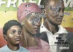
We're really impressed by the gravity of this outdoor piece, part of the War Orphans campaign developed by Kolle Rebbe, Hamburg for Misereor, a German Catholic charity.
According to AdCritic the campaign won a Black Pencil in the Illustration: Press Advertising category at the 2007 D&AD Global Awards. Only two Black Pencils can be won per year, and it's rare that an Illustration entry makes the cut.
D&AD President Tony Davidson explained that "the simple idea behind [...] 'War Orphans' made the jury's decision easy. Naive family wall paintings they may be, but seeing where shells of bullets have shattered the images is a great and easily understood metaphor."
Laments about typography aside, a low-key but powerful image like this one can both transcend and sober most tongues.
Way to be a buzzkill, guys. Just kidding.
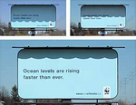
Oh, how exciting. DraftFCB, Toronto has solved the energy crisis, having harnessed the power of sunlight to fuel this billboard. (We always knew agencies could do more than push product.)
Developed for the World Wildlife Fund, its water levels rise when the sun hits it. Text reads, "Ocean levels are rising faster than ever."
If you can make head or tail of these instructions, courtesy of Grupow.com for Unilever's Rexona, you'll have a competitive advantage over us in this game (because you'll actually know how to play it):
Rexona, a deodorant brand from Unilever, offers the possibility of going to England and drive 4 sports car if you can get one of the 4 lowest temperatures in this advergame, where you have to mix speed when typing your arrow keys and some coordination to type them alternate so you can avoid the guy inside the car to sweat while driving.
Despite our confusion we think the graphics and sound quality in this piece is really sexy. We actually felt our fingers tingle in competitive anticipation.
Our only qualm was waiting for it to load while it ticked off the seconds (over 100! Come ON). You know how we hate that.
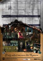
For EA's Harry Potter and the Order of the Phoenix video game, Wieden+Kennedy, Amsterdam remind school kids why lives of fantasy can be way better than everyday education.
See another variant on the print campaign here.
We remember grade school. It was hard enough to drag our asses to class without having to deal with moving stairs, talking pictures and breaks in which we may actually be, well, broken.
Otherwise, the print images speak a thousand favourable words for the quality of the game.


