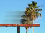
Mustang Blurs Billboards, Point is Equally Blurry
Balendu at Adpunch brings our attention to a series of Mustang billboards that actually blur the scenery behind them. The idea is to lend drivers the impression that Mustang drivers see the world in hyperspeed.
Problem is, the logo's barely-there and the concept is confusing. We're doubt a driver, whose mind is elsewhere, will follow the notion after a brief glance at what appears to be a bit of blurry background. And even if they do, the likelihood that they'll catch the wee little logo is wishful thinking.
This is one of those places where a bit of bold black copy would help bring the concept into sharp relief.

Comments
i've seen this before and it's a piece from a student book. i love the concept but ... i think critiquing student work deserves its own time and place, don't you?
i've seen this before and it's a piece from a student book. i love the concept but ... i think critiquing student work deserves its own time and place, don't you?
I highly doubt that those are actual billboards Ford's paying for. Looks like someone's clever idea that never got executed.
I dunno, the concept seems pretty easy to pick up on, and the blur is just unique enough to be eye catching. Someone should be able to glance at it and say "oh yeah, fast... that's sorta clever".
But you're right about the logo. This is one case where the client's request to "make the logo bigger" rings true.
it's from a student book. nice try.
http://ianhartcw.com/mainpage.html
it's from a student book. nice try.
http://ianhartcw.com/mainpage.html
it's from a student book. nice try.
http://ianhartcw.com/mainpage.html
This advertisement is student work created by Ian Hart and Annie Williams at the Miami Ad School Miami Beach Campus. Constructed from GE Lexan EXL semi-transparent resin, the billboard accurately blurs the scene behind it regardless of day, weather, or season. The billboards are student work only, and were never produced.
Post a comment