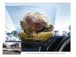
Windshield Sticker Convinces Drivers Not to Speed
While we don't know where, geographically, these windshield stickers were placed, we're quite sure most local PTA's would take issue with it. However, the message is powerful and clear. This poster is exactly what one could be looking at if speeding through a child-filled school zone. It certainly delivers the message.
Written by Steve Hall
Comments (5)
File: Creative Commentary, Good, Guerilla, Outdoor, Poster
Mar-20-06


Comments
This is 2 year old creative that had been recognized at Cannes. Can we please be a little bit more investigative in our ad finding and stop circle jerking over old work.
It's pretty good, but I don't think it was worth killing that little kid for.
It looks like it says "Waikato region" in the text below photo.
Yep, this was a campaign from my old agency Colenso BBDO in Auckland, New Zealand.
And yes, its a couple of years old.
The TAC (Traffic Accident Commission) in Victoria is well known for its graphic, but effective TV campaigns. It is a pity they don't have an archive of them on their website as they would be popular and their message would be spread wider than just showing them on TV.
Post a comment