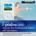
Marketers Could Learn From Microsoft iPod Re-Brand Spoof

OK, we're a few days late in sharing this but a spoof video showing how Microsoft would brand the iPod is hilarious, true and indicative of the horrific packaging and marketing most brands puke out of their verbal diarrhea spewing mouths. Give it a watch then show it to everyone in your company and watch them squirm as they embarrassingly acknowledge, "Uh, yea, we did that once too."

Comments
I especially like the "Stars and Snipes." If I want to jerk the creative director around a bit I'll go into his office and gravely state that the client wants more "urgency" in the ads and thinks maybe a snipe or a starburst would do the trick. Gets him every time.
Good stuff.
2006 redux of the "how to improve a Volkswagen ad" article that appeared in CA back in the 1960s. Not only are the principles of design unchanged, the rationale for ruining it is pretty similar, too.
"We did that once"
I wish my clients learned from their mistakes and only made them once.
This should be seen by every client. If you're an account person, you should forward it.
It just shows that you can emotionally and creatively sell a benefit, or you can 'logically' and heavy-handedly sell features.
In the end, you'll probably make the same money.
But your product will mean vastly different things to consumers.
(and yes, the VW one was the original)
Post a comment